|
|
Post by ROBiT on Jun 16, 2009 12:52:11 GMT -5
Post your artwork here for critisism to be judged. DO NOT: - Soften your rating to try not to hurt their feelings
- Take it personally when you get critiqued, use it for improvement
- Tell everyone "NICE JOB I LUVS IT", tell them why and what you like about it, and/or tell them what needs improv.
- Bribe people to rate you good
- FLAME. You can critisize without flaming.
Here's my recently made piece: 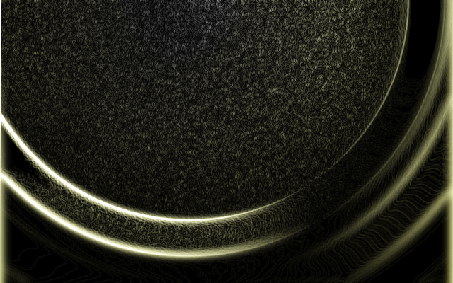 |
|
|
|
Post by ~Memzak~ on Jun 16, 2009 12:54:06 GMT -5
I like, but what is it?
|
|
|
|
Post by ROBiT on Jun 16, 2009 12:54:31 GMT -5
Abstract.
|
|
|
|
Post by The Dark Master on Jun 16, 2009 12:56:55 GMT -5
Well, that's a good piece of art, but perhaps I think some more variation (eg. More of those tube things) instead of lots of those dots to make it look more interesting.
What do you think of my sig picture?
[img src="http://i39.[tinypic.com]/e84scz.png"]
|
|
|
|
Post by ROBiT on Jun 16, 2009 12:58:21 GMT -5
That font does not go well, it is hard to read. Try a different placement, size, font, and colour.
|
|
|
|
Post by The Dark Master on Jun 16, 2009 13:04:50 GMT -5
Ok, thanks for the help..
What do you think of these?
[img src="http://i40.[tinypic.com]/2vuzvuu.png"]
[img src="http://i44.[tinypic.com]/2bnmf6.png"]
[img src="http://i42.[tinypic.com]/n2d7wj.png"]
[img src="http://i43.[tinypic.com]/25qyftg.png"]
[img src="http://i43.[tinypic.com]/214b3tu.png"]
[img src="http://i43.[tinypic.com]/98gh7p.png"]
[img src="http://i44.[tinypic.com]/htfh8z.png"]
[img src="http://i44.[tinypic.com]/2it27lz.png"]
[img src="http://i43.[tinypic.com]/2dbork8.png"]
[img src="http://i41.[tinypic.com]/154hpc2.gif"]
[img src="http://i39.[tinypic.com]/2q9w94p.png"]
|
|
|
|
Post by ROBiT on Jun 16, 2009 13:08:14 GMT -5
Some are a bit pixelated. Try antialiasing them a bit.
|
|
|
|
Post by artik on Jun 16, 2009 18:23:09 GMT -5
I always pay attention to textures in art, and I really liked yours Ozone.
|
|
|
|
Post by GGoodie on Jul 26, 2009 0:19:40 GMT -5
Please excuse the bump, but come on, how active is the art board anyway? I like urs ozone, though you can see some glow/blur "defects" as i call them, where you get a glow coming of the edge of the picture. I usually just crop those off. What about these siggies of mine:     |
|
|
|
Post by The Dark Master on Jul 27, 2009 7:29:46 GMT -5
What base images where used?
Anyway:
[img src="http://i29.[tinypic.com]/ofvb6d.jpg"]
[img src="http://i25.[tinypic.com]/18kew7.jpg"]
|
|


 [img src="http://i41.[tinypic].com/2crmzjb.jpg"][img src="http://i43.[tinypic].com/2i88x2s.png"][img src="http://i28.[tinypic].com/67r1mw.jpg"]


 [img src="http://i25.[tinypic].com/10ygymt.png"]