|
|
Post by FlavaH on Jan 28, 2009 16:14:28 GMT -5
eww just eww
3/10
|
|
|
|
Post by saza on Jan 28, 2009 17:06:54 GMT -5
5/10. Its a Pokemon! What did you expect?
|
|
|
|
Post by I wuv M4( Satar Jaèoèdoæ) on Jan 28, 2009 21:51:44 GMT -5
7/10
For 2 reasons
1: I don't understand what the circutry means and it's sorta boring
2: it's outdated.
|
|
|
|
Post by General Veers on Jan 29, 2009 19:09:50 GMT -5
65%
Your signature, quite frankly, seems to be a jumble of various, noncentered images. Sorry.
|
|
|
|
Post by vaconcovat on Feb 2, 2009 4:48:00 GMT -5
i find that yours is too simple to make. LOL so is mine.
6/10.5
|
|
|
|
Post by Qwerty on Feb 2, 2009 10:14:10 GMT -5
6/10.5...
Probably about a 5/10. It would be better if centered and the pictures linked to the uploads.
I just know mine is getting a low rating...
|
|
|
|
Post by TBP on Feb 2, 2009 14:48:52 GMT -5
4/10. Messy... XD
|
|
|
|
Post by ROBiT on Feb 5, 2009 23:18:54 GMT -5
7/10, text is nice, but the background doesn't fit. You should try a darker, more subtle background, perhaps with reflected text.
|
|
|
|
Post by General Veers on Feb 5, 2009 23:27:14 GMT -5
75%
Blue, but too much...hmm...I think it's called negative space...
Too plain. Like these statements.
|
|
|
|
Post by ROBiT on Feb 6, 2009 22:10:00 GMT -5
8/10 Good ol' pixel art!
|
|
|
|
Post by Sandmaster on Feb 6, 2009 22:14:12 GMT -5
NICE: manual everything (except for brush)
|
|
|
|
Post by ROBiT on Feb 8, 2009 1:39:50 GMT -5
9/10
Love the GC effect, but it's a little rough around some edges.
|
|
|
|
Post by Sandmaster on Feb 8, 2009 9:29:03 GMT -5
10/10! NICE. I love how it conentrates only on the center while the rest blurs out.
I've been trying to fix the rough parts, but MS-P can't really tell you whats wrong.
|
|
|
|
Post by saza on Feb 12, 2009 19:45:33 GMT -5
8/10.
CG! =D Good links in der too.
|
|
subzeroten
Greater Being
 {S=0}The Naturalist[M:-2]
5%
Behold, my new game, in an avatar! :D
Posts: 288
|
Post by subzeroten on Feb 22, 2009 19:32:05 GMT -5
^8/10 sorry, not centered.  |
|
|
|
Post by saza on Feb 24, 2009 18:48:33 GMT -5
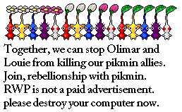
5/10. A picture, Line Art, and a badge. Well, seems to be a glitch that moves the things into wierd places. I can't fix it, either. it's good some days. not the others. Most Likely, I say get a new computer...  |
|
|
|
Post by ROBiT on Mar 9, 2009 21:55:47 GMT -5
Gah... -1/10 for multiaccounts.
|
|
|
|
Post by General Veers on Mar 9, 2009 22:00:06 GMT -5
25% It's an ink splatter "o" with "zone" circumscribed by the "o." Not much color (well, you ARE Monochrome...) Too plain overall. Sorry.
Heh, I can just imagine what rating I'll get... |
|
|
|
Post by ROBiT on Mar 9, 2009 22:35:23 GMT -5
25% It's an ink splatter "o" with "zone" circumscribed by the "o." Not much color (well, you ARE Monochrome...) Too plain overall. Sorry.
Heh, I can just imagine what rating I'll get... The font is completely custom, I worked hard on that!  1/10, you got nothin'. |
|
|
|
Post by Saza on Mar 12, 2009 6:51:50 GMT -5
8/10
Maybe 1 or 2 things could be better.....
If you see my pics as uncentered, you need a new computer.
|
|


 [img src="http://i42.[tinypic].com/oq9gkj.png"] Fàêå Ñóÿilliñ
  [M:7000]